

You want all the pages on your website — your homepage, the pages that explain what you do, your blog posts, and so on — to rank well in search. Unfortunately, what many people get wrong about this is how they approach optimisation. That is, they believe it’s an either/or situation when it comes to content and web design.
For instance:
If you optimise your page with visitors in mind, then you might prioritise web design. After all, if the layout, colours, and typography choices don’t appeal to the visitor, how can you expect them to look at the page and, further, read the content on it for more than a few seconds?
If you optimise your page with search engines in mind, then you might prioritise content. The keywords used, the length of the page, the quality of links on it — you want to hit on all the key ranking factors to ensure that search engines like the page enough to put it as close to the top of results as possible.
In reality, you can’t rank well if you prioritise one over the other.
So, rather than think of SEO as a matter of content vs. web design, you need to make them work together seamlessly.
The Old Way
The New Way
Why is Content & Web Design A Powerful Duo for SEO
Each page of your website serves a specific purpose. That said, the goal for any page remains the same:
- Build the page.
- Optimise it for search (i.e. the user experience).
- Attract visitors from search.
- Make a strong impression with the design.
- Hook them with your content; consequently, driving up time spent on site while lowering bounce rates.
- Convert your traffic into subscribers, members, or customers.
If the content and web design don’t work well together, this won’t happen. And without positive reception to your web page, you’ll never be able to get search engine buy-in.
To establish the right balance, your process needs to bring together both of these worlds.
The following will walk you through the key considerations involved in building and optimising a page using both content and web design.
Brand Personality
If you already have a website, you’ve probably created a style guide for it. Regardless of whether you’ve taken the time to define your brand personality yet or not, really think about how the design choices you make may affect content on the individual pages.
For example:
- Typography: How many fonts are you using? Do they work well together? Are they mobile compatible? Are they easy to read?
- Imagery: Have you chosen a consistent style for all visual content? Does it tell the same story as your brand’s message?
- Colours: What emotions does your colour palette convey? Do the colours you’ve chosen impede visitors’ ability to read your content (even if it’s a hyperlink colour that’s too light or text that’s too hard to read atop dark-coloured images)?
Australia Post, for instance, does a really nice job of keeping the balance between brand design and brand messaging.
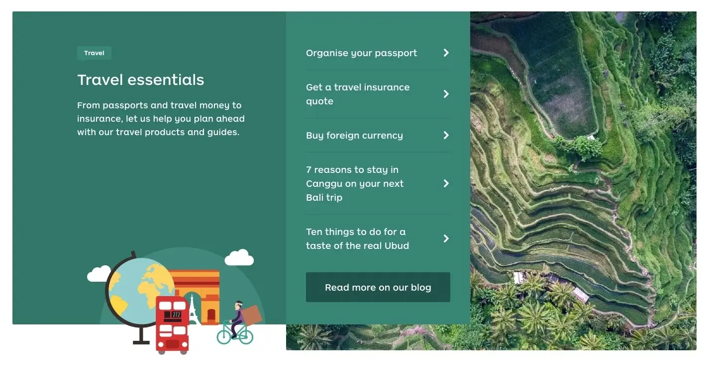
There’s really nothing about the design of this website that would detract from this company being able to get its message across. And, yet, the style is strong and unique and will create a lasting impression for visitors.
The point I’m trying to make is this:
It would be a shame to spend all that time defining your brand’s visual personality only for it to conflict with the words representing it. If your branding presents a roadblock to readability or comprehension, fix it before you begin to tackle page-specific content and web design matters.
Page Goal
Next, ask yourself what is the goal of this page:
- To inform?
- To get leads?
- To convert?
Many of the design and content decisions you make will be influenced by this, and both need to consistently handle it.
For example, let’s say that your goal is to establish authority with a blog. The purpose of a post is not to sell; you simply want to educate visitors on subjects that will improve the quality of their lives. When designing something like this, you want the focus to stay on the content of the page and only be enriched by design elements and imagery when it makes sense.
On the contrary, lead generation and conversion pages should have stronger visual components that actively drive visitors from their entry point to the end form. Content still plays a role as it’s what you use to convince visitors to take action. However, the design is what keeps them engaged and moving along the established path.
Needless to say, it’s important to determine the page goal before you do anything else.
Audience
Don’t forget to define who the intended audience is for this page. Dig deeper with questions like:
- How much time do they have to spare?
- Which kind of content will they be most receptive to?
- How much convincing will they require?
Get inside the mind of your visitor, so you can shape the environment of the page and the messaging on it to drive them to take action.
It might be as easy to say, “We target Millennials and Gen Zers.” With this information, you’d likely decide to use a gamified lead gen element instead of a blink-or-you’ll-miss-it sticky bar. It’s not just age that will affect your design and content choices either. Geography, gender, profession, and other factors can easily come into play.
For example, take a look at the Digital Pigeon website:
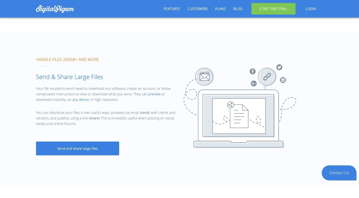
This is a file-sharing platform, which means it targets business owners and freelancers. As such, everything about the website is focused on simplicity: simplicity of design, simplicity of message.
There’s no need to go too in-depth to explain how it works or to overload it with screenshots from the platform. Digital Pigeon makes its argument and provides its very busy and time-constrained audience with a quick way to get started.
In other words, if you understand your visitors’ thoughts and motivations, you can more effectively use design and copy to inspire them to action.
Mobile
Have it in your mind from the very get-go that you are going to need to design and write your web pages for different experiences: desktop and mobile.
While you don’t need to build two different sites, certain deviations should naturally occur based on who sees the page. For instance:
- Multi- vs. single-column
- Pop-ups vs. sticky elements
- Wrapping images vs. full-width images
You may even determine that some content written for the desktop experience just isn’t necessary for mobile at all. And that’s fine so long as what remains on mobile is still valuable and doesn’t compromise the experience.
Wireframe
With a basic idea of what you’re working towards in mind, it’s time to draw up a quick wireframe of the page you’re working on — one for mobile and one for desktop.
This will do a number of things:
- Establish the rules for content and web design as well as how much general space is allotted to each.
- Organise the basic elements of the page from a bird’s-eye view. Decide if there’s anything else that would improve the page’s chances for success (e.g. a table-of-contents above the fold on a 4,000-word post).
- Help your designer and copywriter understand how what they’re contributing fits into the page.
- Create a consistent structure for related pages.
Bottom line: you’re laying the boundaries for the content and the groundwork for the web design with a wireframe.
Page Length
In design, “less is more” is a way of life. In copywriting, however, the general rule is “write only as much as you need to”. In some cases, that can stretch far beyond a couple of thousand words.
While it’s true that lengthier pages give you more opportunities to distribute keywords, embed high-authority links, and unpack every angle of an idea, you shouldn’t create lengthy pages solely for the purpose of exploiting known SEO techniques. You’ll soon find that length for the sake of length won’t get you far in search results.
Instead, focus on building in value.
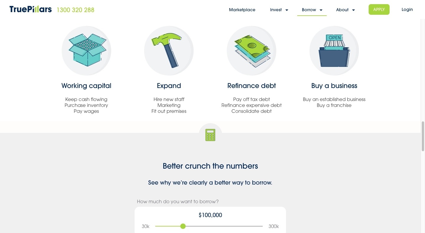
If you want to give off the perception that a page is longer and more authoritative, use visuals and well-designed header blocks to help tell the page’s story and expand the size of it. TruePillars has a brilliant example of this in which it communicates a lot without having to use a lot of words to do so:
If you want to create a monstrously epic web page or blog post that covers a topic from end-to-end, go for it! Just be mindful to create breaks every few hundred words or so to make the lengthy piece more easy to digest.
Space
Perhaps a more important factor to consider in terms of the “size” of the page you’re designing is space.
For years, minimalism and abundant white space have allowed us to build beautiful-looking web designs that put the primary focus on a page’s message. But that’s just one of the ways in which spacing can work to your benefit in SEO.
Specifically, think about the content and the space within it.
- Does the chosen typography allow for enough breathing room between words and letters?
- Does the font size force each line to have too many or too few words on it?
- Are the spaces between lines too tight?
You want to design the content to breathe just the right amount.
Content Structure
Much like how the wireframe sets general guidelines for how a page is to be laid out, this will do something similar for content.
For example, your list of guidelines might include:
- Headline = < 55 characters
- Intro = < 200 words
- Header tags = < 50 characters
- Paragraphs = < 4 lines each
- Images/videos = 1 every 300 words
- Hyperlinks = 1 every 200 words
- Focus keyword density = 0.5% - 3%
You can see good examples of well-structured pages on the Ray White real estate group’s blog:
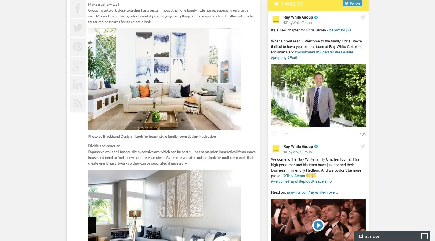
Paragraphs never run too long, informative header text is included, and images are scattered throughout to support the content of the page.
By establishing a content structure, you’ll give your page designs a consistent look and quality — something that’s sure to get noticed by visitors as well as search engines.
High-Quality Content
+ High-Quality Design
= SEO Success
It doesn’t matter how beautiful your web design is if content is poorly written, difficult to get read, or not well-optimised for the user experience or search.
David Pagotto Tweet This
The same goes for amazing content placed within the context of a lacklustre web design.
If you really want your web pages to make a big splash in search results and with visitors, the design and content must blend well together.
To be sure, there are other (more technical) factors to consider when it comes to optimising a web page for search. Loading times. Security. Backlinks. Metadata. Image optimisation. And much, much more.
If you’re curious to see how good of a job your web design, content, and other optimisations are doing, schedule a free audit now and speak to one of SIXGUN’s strategists.
Hero Image Source: Pixabay